Groundwork Electrical
Identity Package
Business card, letterhead & envelope, notecard & envelope.
Approved Design

Alternate Designs


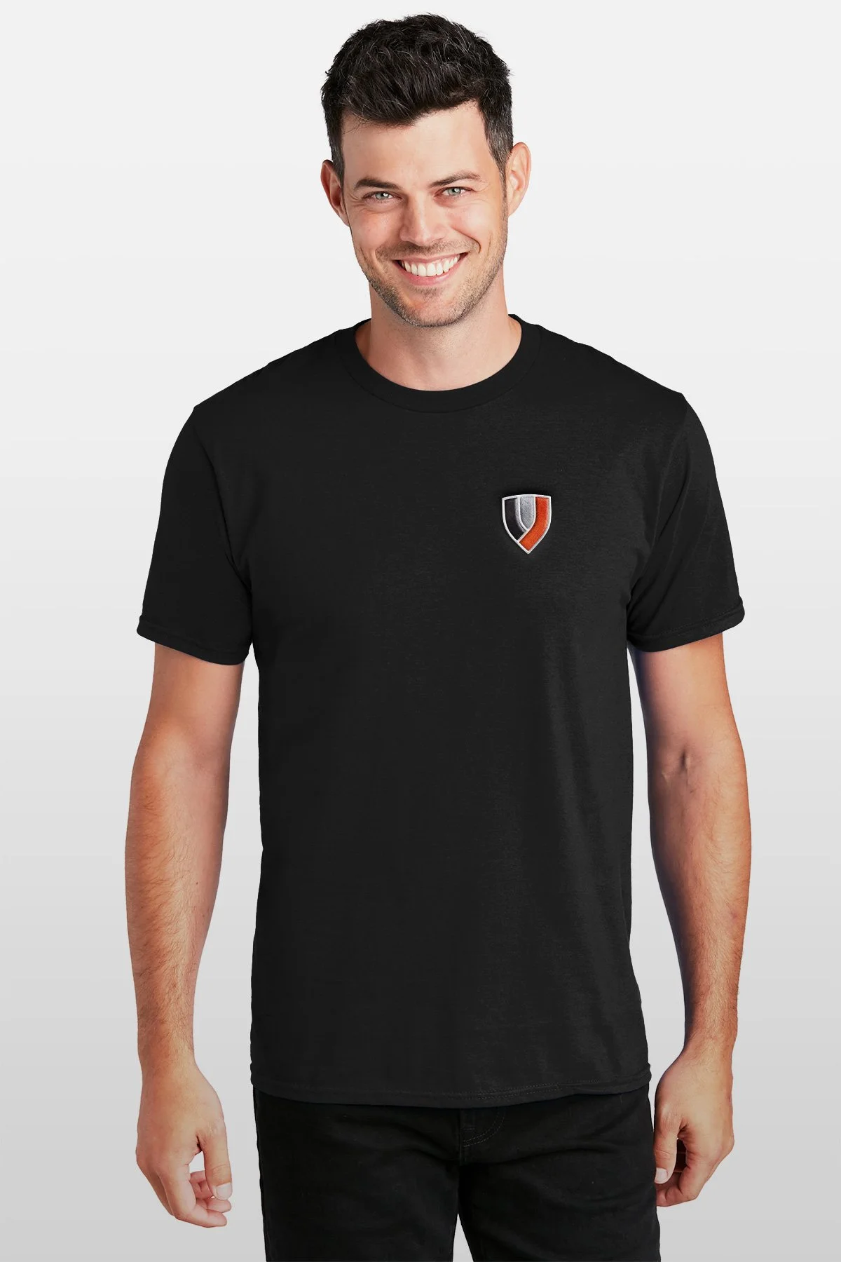
Apparel
Jacket Embroidery
T-shirt Embroidery

Alternate Option T-shirt Screenprint


Cap Embroidery
Email Signature
Two Options. Set image to original size after placing in an email.


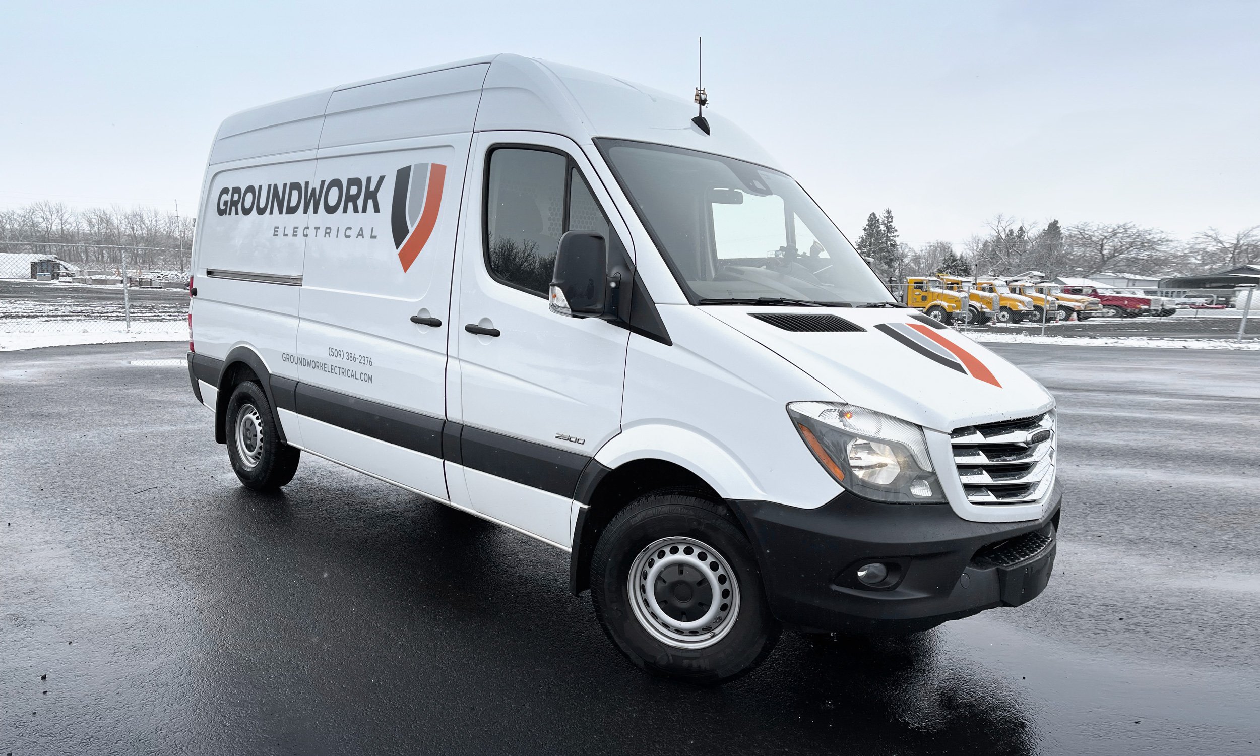
Sprinter Signage


Logo Design
Final Logo

INITIAL LOGO DEVELOPMENT
Finalists
Three badge designs. Multiple type arrangements.
(Any badge will work with all type arrangements.)
Initial Presentation
We discovered early on that the word “groundwork” isn’t easy to read at a glance, so most of the designs attempt to help improve legibility by segmenting the compound word with color, capitalization, graphical element, or line break.
We’ve landed on a color scheme (bright red on black/white/gray), font (simple bold geometric sans-serif), and a few general concepts to focus on. The logos are shown in no particular order other than that we’ve put ones we kind of like at the top of each of the five sections: Connection, Polarity, Wiring, Power Source, Ground.
1. CONNECTION
Strength: Focuses on the physical aspects
Challenge: Potentially not serious enough


2. POLARITY
Strength: Focuses on a generally understood electrical concept
Challenge: Voltage differential is kind of the opposite of ground


3. WIRING
Strength: Focuses on something people see
Challenge: Legibility issues (ork)


4. POWER SOURCE
Strength: Focuses on the customer’s point of interaction with your product
Challenge: A little whimsical?


5. EARTH / GROUND
Strength: The actual concept in the name
Challenge: Symbols either literal/simple (arrow) or obscure (earth ground)


